Burgundy, Coloured Glass and Layered Patterns: Decorex’s Fresh Interior Directions
Decorex 2026 Interior Design Trends: Burgundy & Patterns
SHARE:
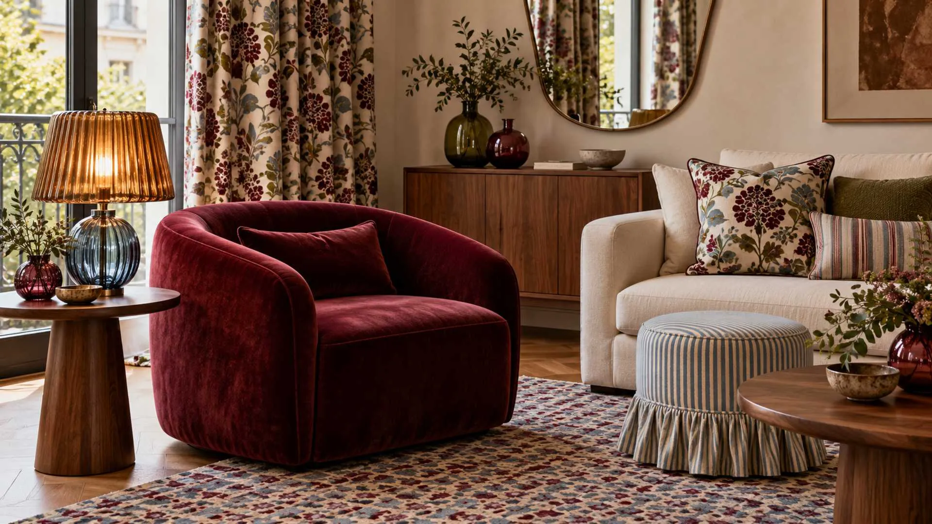
A wine-red chair. A coloured-glass lamp. A patterned curtain that refuses to disappear into the background. The latest interior directions from Decorex offer plenty of inspiration for anyone whose home feels a little too carefully coordinated.
Warmth and decorative detail emerged strongly in Houzz’s coverage of Decorex 2026. Held at London’s Olympia from October 11–14, the show brought together around 280 brands, with rich colours, patterned surfaces and expressive lighting among the highlights.
For Indian homeowners, these interior design trends offer an opportunity to rethink familiar rooms without immediately replacing everything inside them. A neutral apartment can take on a different character through upholstery, lighting and a more adventurous mix of materials.
The most useful idea is to give each room something memorable and enough space for it to stand out.
What are the top interior design directions from Decorex 2026?
Houzz’s Decorex 2026 coverage highlights burgundy, decorative layering, coloured lighting and richly textured surfaces. For home interiors, these directions suggest combining a strong colour with varied materials and carefully coordinated patterns. Start with one focal piece, then build the surrounding scheme around it.
These are ideas to adapt to a room’s light, dimensions and daily use. A successful exhibition display can be visually intense; a living room also needs to accommodate homework, conversations, storage and an ordinary Tuesday evening.
Burgundy moves beyond the occasional cushion
Burgundy was a standout colour in the Houzz report, appearing across different materials and applications. One notable example was Arte’s Bordeaux-coloured Nilaya wallcovering, from a collection inspired by Mysuru’s foliage and silk heritage. The connection offers an interesting Indian reference within the London showcase.
The colour’s wider momentum has supporting evidence. In its 2026 designer survey announcement, 1stDibs reported burgundy at 21% among designers’ anticipated colour choices. That indicates professional interest, rather than a measure of what every household is buying.
For homeowners, the first decision is how much presence burgundy should have. A dining chair or cabinet front creates a different commitment from repainting an entire room.
The Living House explains that burgundy can lean towards brown or purple, making physical samples more reliable than colour names. Its guidance also identifies combinations with cream, powder blue, pink and olive.
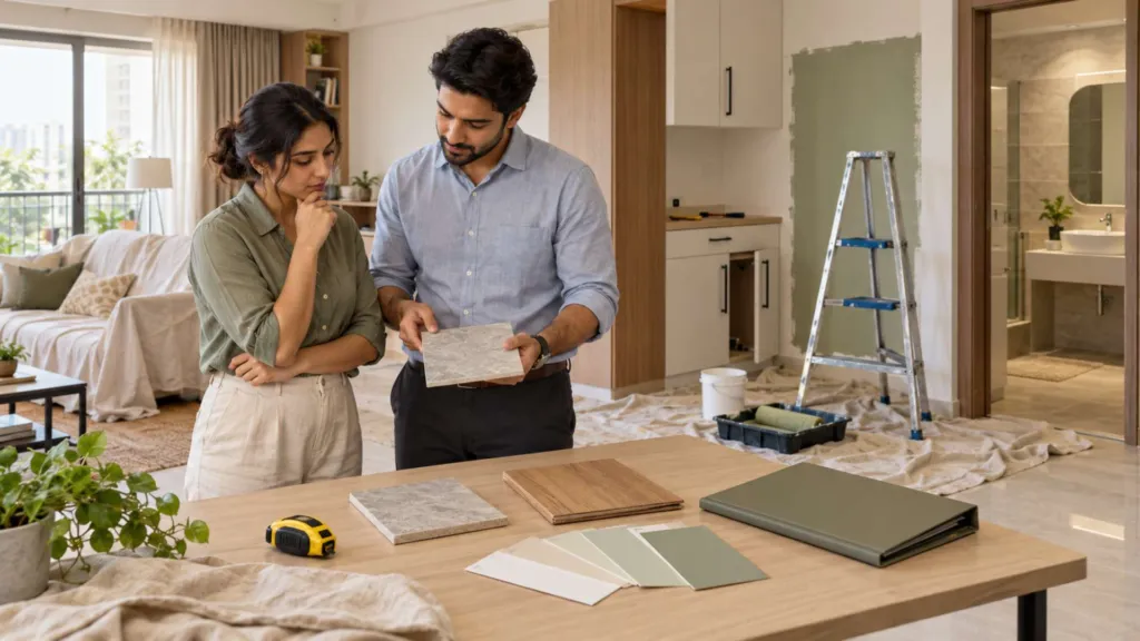
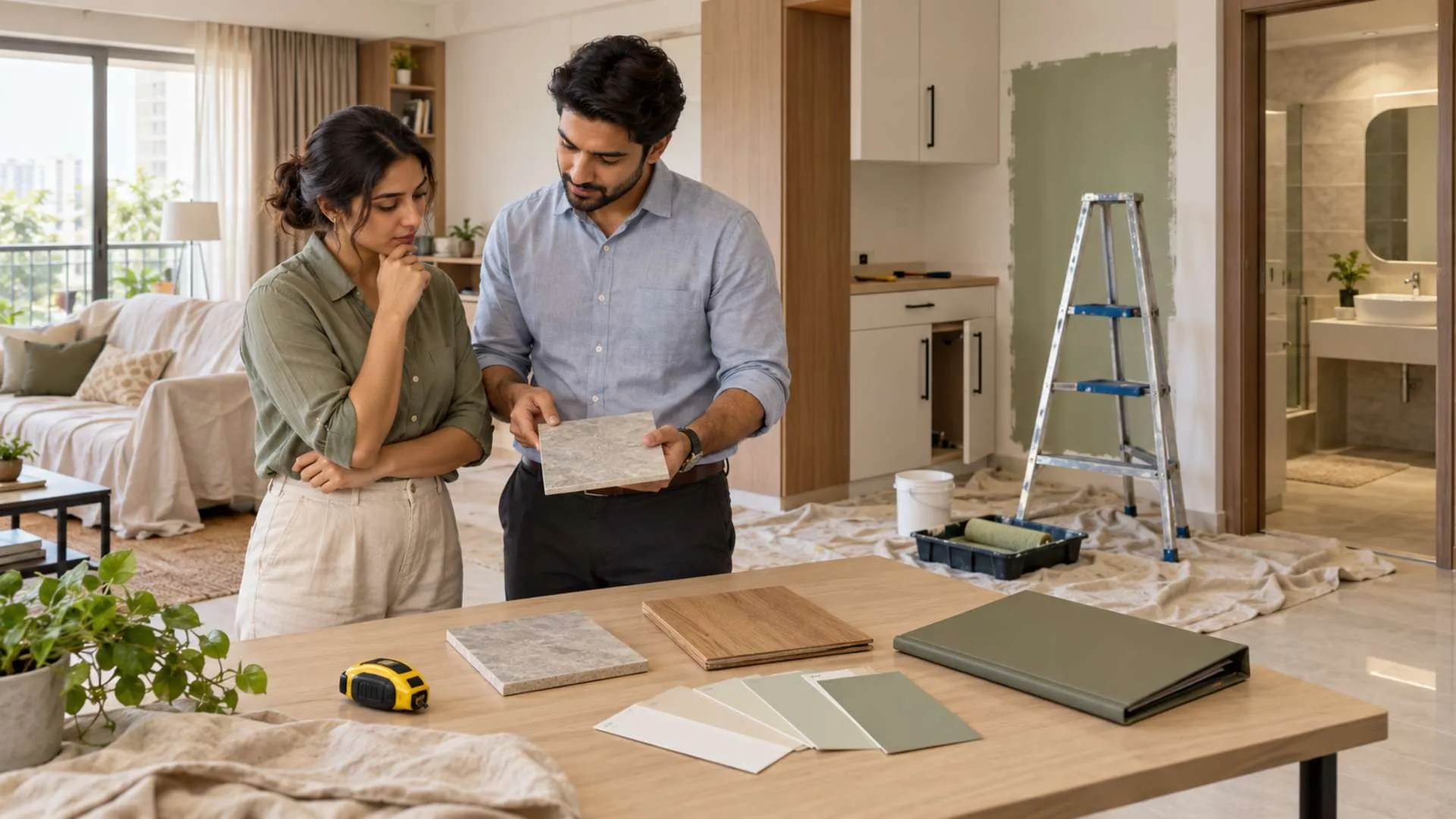
Try a sample beside existing flooring, curtains and woodwork before placing an order. Look at it in daylight and under the lamps used in the evening.
For a compact living room, consider a burgundy armchair against a pale background. For a dining area, upholstered seats can introduce the colour without changing the walls. In a bedroom, a headboard provides a larger surface while keeping the scheme concentrated.
Choose the colour’s role before choosing everything that matches it. Otherwise, an attractive accent can gradually become an expensive room-wide obligation.
The look also has a longer history than this year’s show. AD Middle East’s 2024 burgundy feature documented Gucci’s Rosso Ancora reinterpretations of design classics and explored burgundy through lacquer, upholstery and glass. Its earlier publication date matters: these examples help explain the colour’s continuing appeal, rather than serving as new Decorex launches.
Coloured glass gives lighting a decorative role
The coloured-lighting direction invites homeowners to consider a fitting’s appearance while it is switched off, as well as the light it produces.
A glass pendant above a dining table can become a focal point. A small coloured-glass table lamp can introduce interest to a console. A pair of glass objects on a shelf offers an easier experiment before committing to a permanent fitting.
But colour alone should not determine the purchase. Ask to see the actual lamp illuminated. Check whether it gives useful light, creates distracting glare or changes the appearance of nearby finishes.
AD Middle East’s feature offers a useful example of material complexity: the Parola lamp, originally designed in 1980 and reinterpreted in Rosso Ancora, combines an opal diffuser, transparent support and crystal base. It demonstrates how different glass treatments can contribute to one object.
For an Indian apartment, try keeping the main working light dependable and introducing decorative glass through a separate lamp or pendant. This allows the room to serve different purposes.
A dining pendant, for example, should leave people comfortable at the table. A beautiful bedside lamp still needs to work with the household’s reading habits.
Treat decorative lighting as part of the room’s function, rather than an accessory selected after everything else.
Layered patterns need a shared language
Houzz describes a strong decorative mood at Decorex, including patterned textiles, pleats and ruffles. Its examples included a skirted ottoman from Isabel & Co., a reminder that furniture can carry pattern and detail beyond the seat cushions.
This direction fits the broader interest in maximalism. The 1stDibs survey announcement identified maximalism at 39% among the aesthetics expected to remain popular in 2026. The figure describes surveyed designers’ views; it should not be presented as an Indian homebuyer preference statistic.
At home, begin with a pattern you already want to live with. It might be a rug, curtain fabric or inherited textile. Use its colours to guide the next selection.
A practical starting combination is a larger motif, a simpler stripe and a plain textured surface. The Living House similarly recommends varying pattern scales while retaining related colours.
For example, try a botanical cushion with a narrow-striped chair and a plain sofa. Lay the samples together before ordering and check them from the distance at which people will normally see the arrangement.
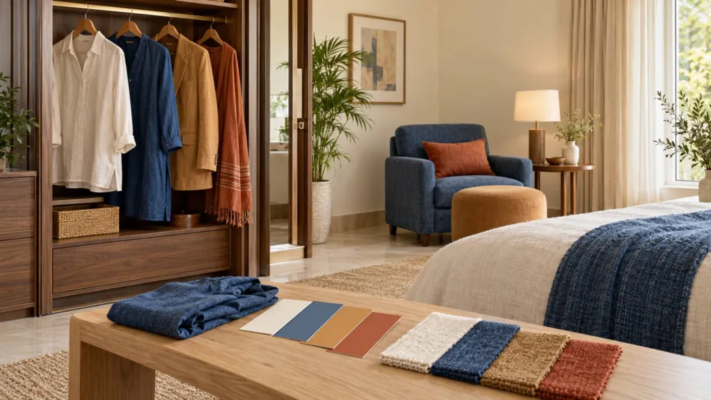
The blue-and-brown pairing can be explored in the same way. Consider a pale blue curtain beside an existing brown sofa, or blue cushions against walnut furniture. Treat this as a styling option rather than a requirement to replace a successful palette.
| Interior direction | A manageable first step | What to check |
| Burgundy | One upholstered chair or headboard | Colour beside existing finishes |
| Coloured glass | A table lamp or dining pendant | Light output, glare and cleaning |
| Layered patterns | Two coordinated textiles | Pattern scale and repeated colours |
| Blue and brown | Blue accents with existing timber | Balance between light and dark surfaces |
| Skirts and ruffles | A removable ottoman cover | Fabric care and floor clearance |
Sofa skirts and ruffled furniture also deserve a practical assessment. Before selecting a full-length skirt, consider cleaning access, pets and how the fabric will sit against the floor.
A tailored cover may suit one room; a gathered finish may suit another. Request a fabric sample and discuss maintenance with the upholsterer.
Bringing the look into Indian homes and show apartments
The strongest adaptation begins with what the home already contains.
An existing timber cabinet, a family rug or a favourite artwork can provide the starting point. Photograph the room, identify the pieces that will stay and decide which single change would have the greatest effect.
For a rental apartment, portable choices make sense: lamps, cushion covers, curtains where permitted, and smaller furniture. For a newly purchased home, test colours before committing to extensive joinery.
If organic shapes appeal, explore an Art Nouveau reference through one detail. The Victoria and Albert Museum describes the historical style through natural forms and flowing lines. A contemporary interpretation could use a botanical textile or curved mirror alongside simpler furniture.
There is also a useful lesson for developers designing show apartments and shared spaces. A distinctive palette can make a room easier to remember, but visitors still need to understand the usable space.
Keep circulation clear. Show how furniture fits. Explain which finishes are included and which belong only to the styling. A convincing interior should help buyers imagine daily life within the floor plan.
Burgundy, coloured glass and layered patterns give Decorex’s fresh interior directions plenty of relevance beyond the exhibition hall. Their value lies in offering choices: richer colour, more expressive objects and rooms that accommodate personal possessions.