Does Your Wardrobe Really Reveal Your Ideal Home Colour Palette?
Wardrobe Colours for Home Interiors: Find Your Ideal Palette
SHARE:
Before purchasing another paint sample, check your wardrobe.
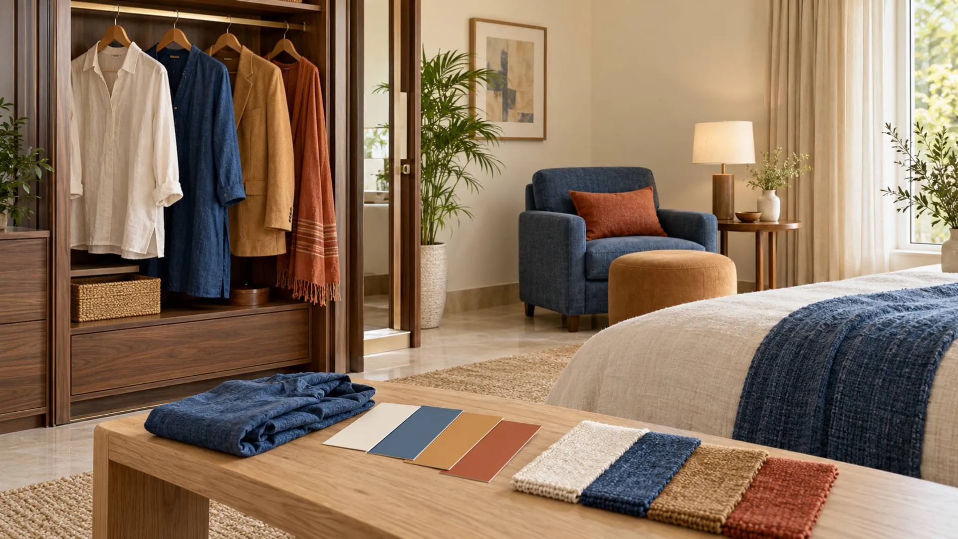
The cream shirt you constantly wear, the indigo kurta you find hard to part with and the burgundy scarf that elevates any outfit might hold some answers to your preferred interior design colors.
Consider that the decisions already made have to do with the degree of contrast, texture and color saturation that you prefer; applying these choices to a room’s design requires more deliberation than a simple decision to match your walls to your favorite dress.
In fact, a person’s wardrobe may provide an ideal starting point for their home’s color scheme.
The lighting of their room, its existing finishes and purpose will dictate how the inspiration should be adjusted. For example, homeowners furnishing a new flat or simply refreshing an existing one could find a personal alternative to a show apartment in their own closets.
Can your wardrobe really reveal your ideal home colour palette?
Yes, as inspiration rather than a reliable prediction. Favourite clothing colours, textures and combinations can help identify a personal colour palette for interiors. Translate those preferences into background, furniture and accent colours, then test them against the room’s lighting, flooring and intended use. A colour you enjoy wearing may work better in cushions than across every wall.
That distinction separates a useful styling exercise from an expensive decorating mistake.
What the wardrobe-and-interiors research actually shows
The fashion–interior connection has attracted attention for years.
In a 2018 survey of 2,000 US consumers, Trunk Club and CB2 found that 72% said they could predict someone’s wardrobe from their interiors, or their interiors from their wardrobe, to a moderate, high, or very high degree.
The Trunk Club announcement published through PR Newswire also reported that nearly 40% believed their happiness would improve if their wardrobe and home interiors were aligned.
These are statements of belief. The survey did not demonstrate 72% predictive accuracy or measure an improvement in happiness after redecorating.
The strongest practical argument is simpler: clothing provides a collection of choices you have already made.
In Home Beautiful’s discussion of wardrobe-inspired decorating, editor Elle Lovelock explains that outfit-building skills can help people approach home styling. The article also presents fashion designer Genevieve Smart’s counterpoint: the home may serve a different emotional purpose from the clothes worn outside it.
Someone who loves vivid outfits may want a quieter bedroom. A person wearing black for work may prefer a colourful living room.
Personal style offers clues; it does not issue decorating instructions.
How to translate wardrobe colours into interior design choices
Start with clothes you choose freely and enjoy repeatedly. Uniforms, dress codes and purchases you regret can distort the picture.
Juliette Moreau’s wardrobe palette guide on Medium recommends examining frequently worn pieces and recurring colours, alongside items that remain untouched. It is a personal styling guide rather than scientific research, but the wardrobe audit provides a useful starting exercise.
Lay out a few favourite outfits. Look for three things: the background shades, the supporting colours and the small details that make the combination interesting.
A cream-and-denim outfit with tan accessories could suggest an ivory backdrop, blue upholstery and warm wood. A black outfit with emerald earrings might inspire pale walls, dark furniture details and a green accent chair.
These are illustrative translations, not fixed style rules:
| Wardrobe preference | Possible interior direction | A palette to test |
|---|---|---|
| Crisp, neutral basics | Scandinavian or contemporary minimalism | Warm white, pale wood, charcoal |
| Linen, earthy prints and woven accessories | Relaxed boho | Cream, terracotta, olive |
| Strong tailoring and dark contrasts | Structured contemporary design | Ivory, graphite, walnut |
| Saturated colours and mixed prints | Eclectic or maximalist interiors | A restrained base with jewel-tone accents |
| Tonal outfits and subtle textures | Quiet luxury | Oatmeal, taupe, brown |
Notice that colour is only part of the exercise. A preference for linen, leather, embroidery or polished jewellery can suggest textures and finishes without determining the paint shade.
For a shared home, repeat the exercise with everyone using the room. Overlapping preferences can guide the common areas, while private rooms allow more individual expression.
Seasonal colour analysis: Borrow the language, loosen the rules
Seasonal colour analysis groups personal palettes into Spring, Summer, Autumn and Winter, using distinctions such as warm versus cool, light versus dark, and clear versus muted.
Moreau’s guide describes Spring as warm and light, Summer as cool and soft, Autumn as warm and muted, and Winter as cool and high-contrast.
For home decor, those categories can become creative prompts:
- Spring: Consider peach, butter yellow, fresh green and cream.
- Summer: Explore dusty blue, soft rose and gentle grey.
- Autumn: Try rust, olive, tobacco and warm ivory.
- Winter: Experiment with navy, emerald, crisp white and dark accents.
These room combinations are suggestions, rather than prescribed seasonal-analysis results.
A room does not have a complexion. Its fixed materials and lighting matter more than whether its owner has been assigned a particular colour season.
The useful question is therefore: do you prefer warm, cool, muted or bold home styling colours and how much of each feels comfortable?
You can also borrow a single colour family without adopting the whole seasonal palette. An Autumn-inspired room, for example, need not contain every earthy shade at once.
Why your favourite outfit colour may not belong on every wall
A red jacket occupies a different proportion of your view from four red walls.
Colour consultant Max Ruthven makes this distinction in Let’s Talk Color’s article on wardrobe-inspired paint choices. Enjoying a saturated clothing colour does not necessarily mean wanting it as a continuous room backdrop; accessories and smaller accents may be more suitable.
Maticad’s interior colour guide offers the familiar 60–30–10 guideline: a dominant colour, a secondary colour and a smaller accent contribution. Treat the proportions as a flexible composition tool, rather than an exact calculation.
For a living room colour palette inspired by navy clothing, that could mean warm neutral walls, a blue sofa and small rust-coloured details.
For bedroom colour ideas drawn from a colourful scarf, choose one softer shade for a larger surface and reserve its brighter colours for textiles.
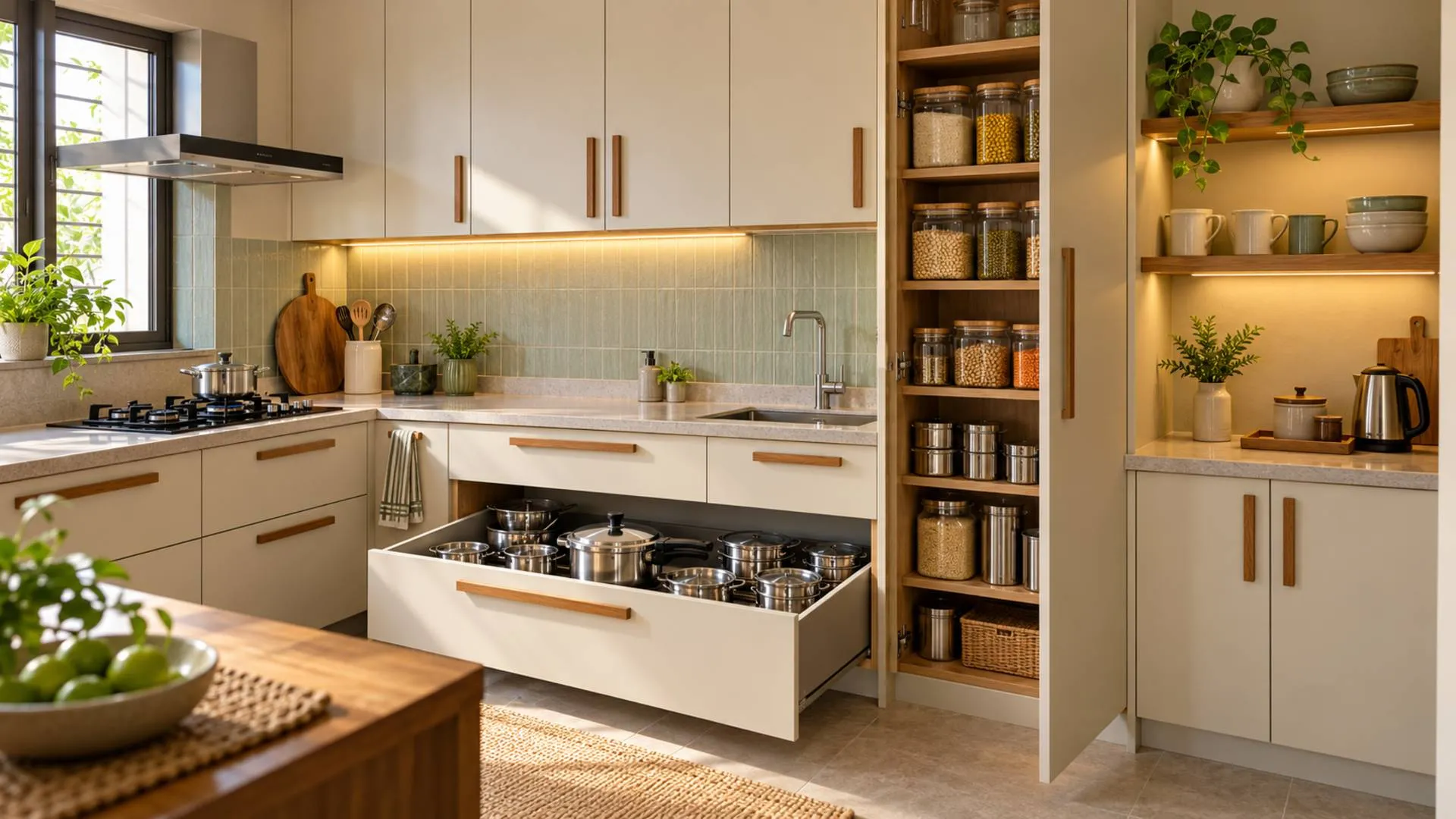
Cabinetry matters too. Here, “wardrobe colour” refers to the furniture itself. Birla Opus discusses combinations including white and wood, beige and brown, and cream and walnut. Simpolo’s wardrobe-colour guide likewise recommends considering wardrobe shades alongside tile selections.
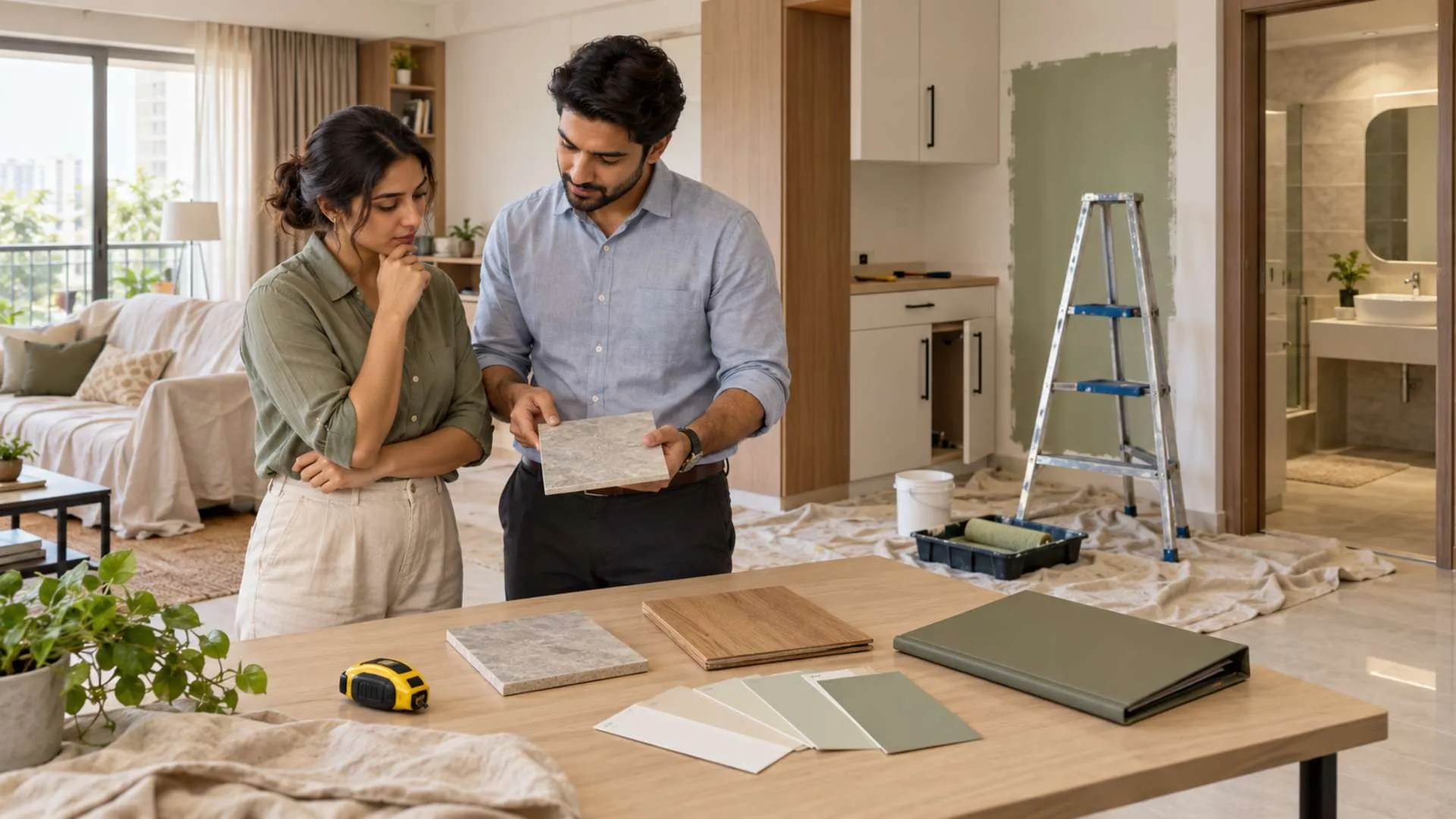
Before introducing a new palette, place samples beside the flooring, doors and storage fronts you intend to retain.
Maticad also stresses that natural and artificial lighting change colour perception. Check samples during the day and under the lamps you actually use at night.
Burgundy, earthy tones and the 2026 fashion–home crossover
Home decor trends in 2026 inspire, but your favourite clothes can help decide which trends deserve a place in your rooms.
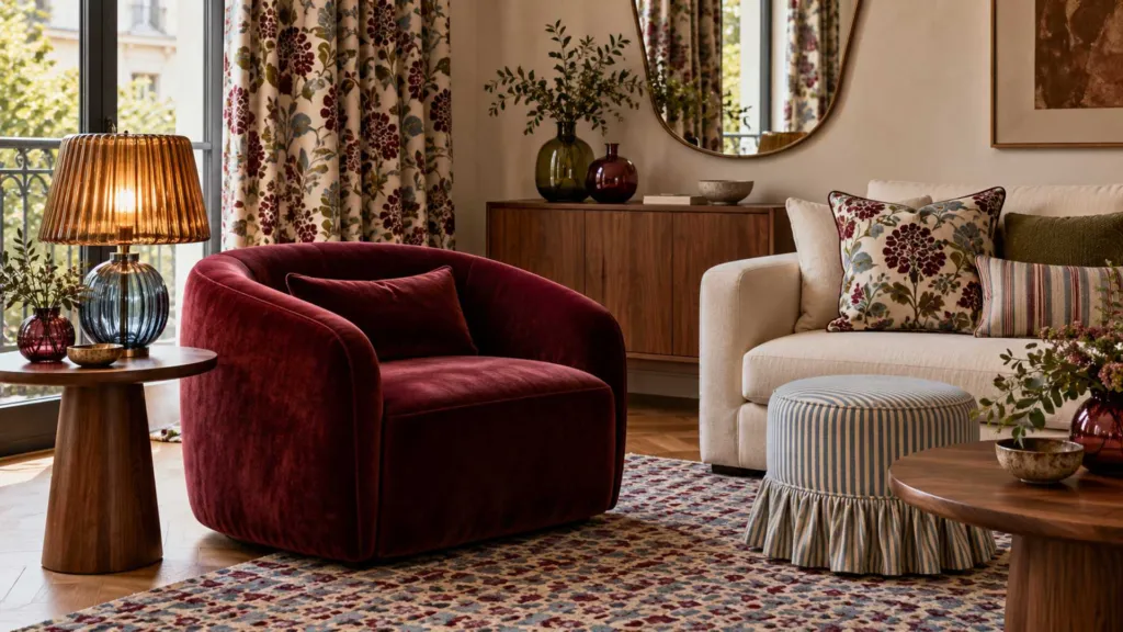
Burgundy offers one example. In its guide to 2026 designer trends, 1stDibs reports that 21% of surveyed designers intended to use burgundy, compared with 7% in 2022, a threefold increase. Its account refers to the survey conducted in 2025 looking towards 2026.
That documents designer interest. It does not establish that fashion caused the interior colour trend.
If burgundy already appears among your favourite clothing colours, try it through a lampshade, cushion or upholstered piece before committing to extensive cabinetry. Earthy tones can be approached through the same gradual process.
Indian wardrobes offer particularly personal starting points. An indigo kurta, an ivory sari with a gold border or a jewel-toned dupatta might inspire blue textiles, warm metallic details or an accent colour.
There is no single Indian home palette. Regional traditions, personal memories and everyday preferences can lead to very different combinations.
Colour psychology at home also needs proportion. The reviewed references discuss associations and preferences, but do not substantiate a universal 15% stress reduction from matching clothing and interiors.
The better test is lived experience: does the room remain comfortable after the initial excitement fades?
Let your wardrobe start the conversation
Your wardrobe can reveal a home colour palette worth exploring, particularly when you examine repeated choices rather than a single fashionable purchase.
Choose an outfit you love, extract a background shade and two supporting colours, and test them against your room’s existing materials. Start with reversible changes before buying expensive finishes.
For homeowners, designers and developers presenting interiors, the useful conversation begins with how people want to live in the space. A personal colour palette gives that conversation somewhere concrete to start.

FAQs:
 Burgundy, Coloured Glass and Layered Patterns: Decorex’s Fresh Interior Directions